What CRSE does
The repo lives here: github.com/ABHINAVVV13/cognitive-response-similarity-engine. CRSE lines up two clips, feeds them through TRIBE v2, and gives me a score for how similar their predicted cognitive footprints look.
I used it to compare CoLabs Auto Review and Anthropic Claude. Both demos are public: CoLabs on YouTube and Claude on YouTube.
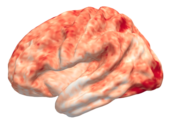
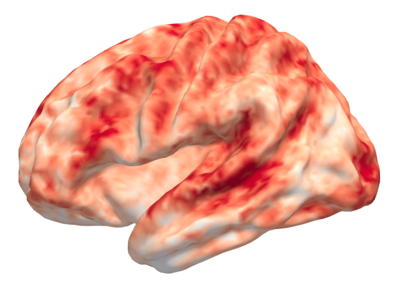
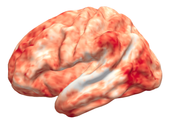
The Auto Review demo appears to engage language and speech related regions more strongly, which fits the fact that it is narrated. The Claude demo appears to drive stronger visual response patterns, with much weaker language related activity, which also makes sense because it is mostly visual and uses music instead of spoken explanation.
Differing signals
I thought it was a neat way to compare not just what demos show, but how they may cognitively land depending on whether they rely more on narration, visuals, or both. The heat maps below are the quick snapshots that came out of CRSE.
Similarity timeline
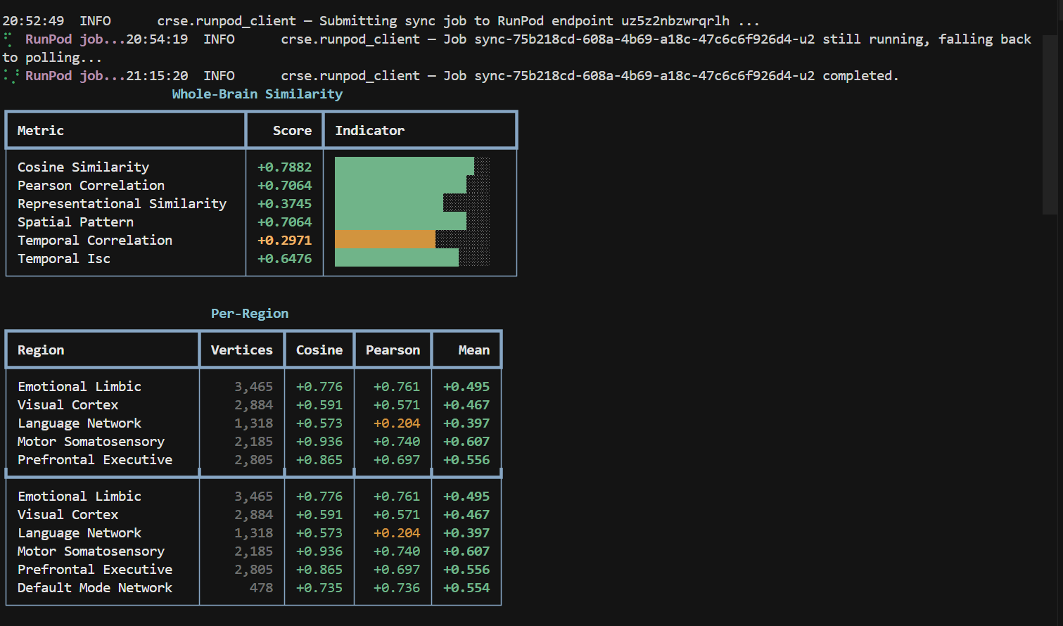
Both demos have a visual correlation of 0.7, so I would say they are pretty similar on visual activity. At the same time the language heavy beats from Auto Review keep pulling the score down whenever the Claude video stays silent.
Audience angle
And honestly the customer reach that each company is aiming for is different. Anthropic Claude and ChatGPT demos aim for general users, they use music in their videos, they have softer animations and tend to leave technical stuff out. They look more playful, if that is the right word.
Colab’s demo keeps it technical and to the point. Maybe the aim is to target engineers. CRSE makes that contrast obvious instead of arguing over vibes.
Why I am sharing
I think this could be an interesting tool to see how users or customers comprehend or emotionally receive UI, demos, marketing ads, and so on. Feel free to fork the repo, plug in your own videos, and let me know what patterns you see.